


Wantit Design System
Imagine you are desperately searching for a particular fashion item—be it a pair of shoes from your favorite brand that's out of stock everywhere, or a captivating purse you spotted on a stranger? What's your next move? A Google search, perhaps? In the end, most people turn to the secondhand market.
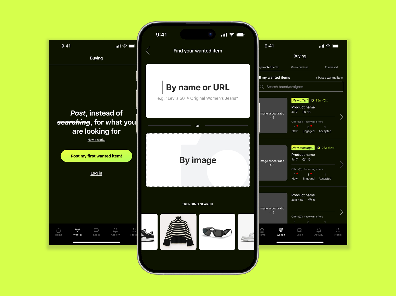
Instead of spending hours vetting through listings from sellers, the Wantit app flips traditional peer-to-peer e-commerce: post what you desire, and sellers respond with matching offers.
The Challenge
For a product that introduces an old concept in a new way, the challenge lies in ensuring users can grasp it at every stage. One design consideration we consistently kept in mind was how to use visual cues to effectively guide users and inform them of its functionality, which is a reversed version of the traditional P2P e-commerce model.
The Solution
The most-struggled user group was those who shop and sell on the app simultaneously. They struggled to differentiate between the shopping and selling flows due to their deep-rooted conditioning to traditional P2P models. This required considerable cognitive effort to remember that they were operating within a reserved model on Wantit.
To reduce cognitive load, we differentiated the shopper and seller screens in a very obvious way.

What I created (so far)
260+
Production-ready screens
100+
Interconnected components
100%
Marketing visual assets

Overview

My Role
Product Design lead

Collaborators
Co-founders
Irina–Product manager
Addison–Full-stack Enginner
Tools
Figma
Notions
ChatGPT
Copilet AI Image Generator
Google suites
Deliverables
MVP native app screen design
MVP design system
Figma component libraries
Documantation (WIP)
step 01
Understanding the space
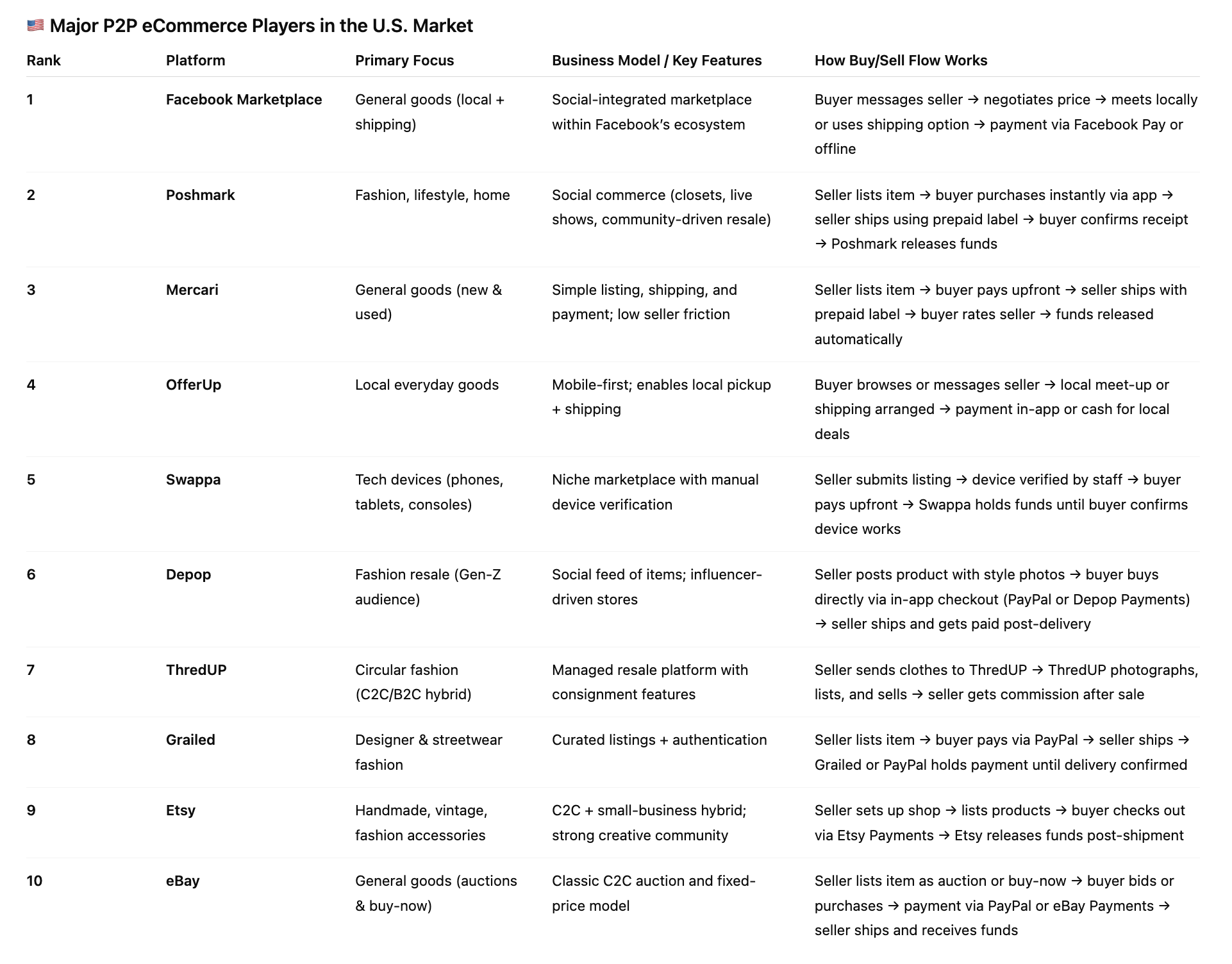
The biggest P2P e-commerce players that focused on generic fashion in the US market so far are Poshmark and Mercari. Our primary users would be those already using those apps. Secondary users would come from those using Facebook Marketplace, OfferUp, Depop, or eBay.
step 02
Combining familarity with novelty
As soon as we realized that the most critical issue was that users struggled to differentiate between the shopper and seller flows, we had many discussions about how to address it.

step 03
Doubling down on the obviousness
After we nailed down the most critical usability concern, we learned that we still have some nitty-gritty issues to button up. One of those minor but essential design decisions we spent quite some time on is the card design on the home page.
How might we ensure users understand instantly that these cards are NOT listings from sellers, as in a traditional e-commerce app, but instead posts from shoppers who want to purchase these items?

step 04
Establishing the foundation
For the MVP, we decided as a team to focus on launching it in the Apple App Store. The reason is that Apple has stricter app approval guidelines, and designing to adhere to those guidelines will check most boxes for the Google Play Store.

step 05
Designing for one and for all
Although I am the sole designer and the team is still small, scalability is always at the back of my mind when I create design systems. All components are designed to be reusable and flexible so that any future users can hit the ground running on day one.

current state
Beta testing
The app is currently beta testing with about 500 users. We are in the process of finding product-market fit and proactively iterating on the design based on testing feedback. Stay tuned for the official launch!